Psychology of Color and Marketing to your best Audience
The psychology of color is one of the most interesting subjects out there. This is mostly because there are vastly different opinions about what works and what doesn’t. There are those out there who believe that the psychology of color is that there is no psychology of color. There are others who believe that color will make the difference between people ignoring you and people buying up everything you have to offer. The truth is, there is no magic bullet that will fix sales for you. However, there is some basic color theory that does actually have an impact on how your marketing and branding function.
Is there even a psychology of color?
There are very different schools of thought on this. Some believe that color is the difference between magical numbers and dead last. Others believe that this is a myth. Whatever you believe, there is certainly significance to color. Red may mean masculinity and danger, or blue may mean calm and soothing. In the end, color is a personal interpretation. I may feel very differently about a color than you might. However, there are some universal principles when it comes to color.
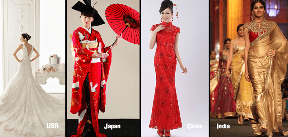
First, colors are very culturally entwined. Cultural history dictates the definition of a color and how individuals in a culture use a color. For example, in western cultures, the color white signifies purity and is common at weddings. In some Asian cultures, however, white is used for funerals and signifies death. While red is a very common color to associate with romance, it is also used in east Indian weddings to adorn the bride. In western cultures, we commonly associate blue and green with calm. All of these meanings have deep roots in culture that goes back millennia.
Second, colors can make a connection with us based on their nonverbal communication queues. Color can be a method of communicating to your brain from a different source. Reliability, appeal, and distrust can all be communicated through color. This is why color psychology is so important when it comes to marketing and branding. Your logo can communicate to your consumers exactly what it is that you are intending to do for them. You can also communicate certain feelings to your consumers simply by using color.
How is marketing impacted by color?
There have been studies about ambiance and how it affects retail environments. Retail environments spend a lot of money finding out what makes a consumer purchase more product. What they have found is that trust is communicated by color, along with a host of other feelings. In particular, there are certain colors known to make people hungry. For a restaurant, this is an invaluable trait of a color. The restaurant can strategically place color in certain areas to entice hunger, and thus, prompt consumers to buy more product.
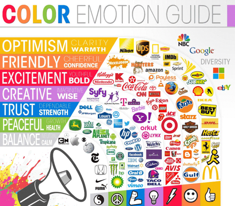
There is another application to this theory, though. Many researchers have indicated that logo presentation and color combinations have a huge impact on consumer perceptions and how reliable the company is perceived to be. There is a large section of research indicating that different colors appeal to different genders as well. The universal spectrum of colors, however, remains valid for both genders.
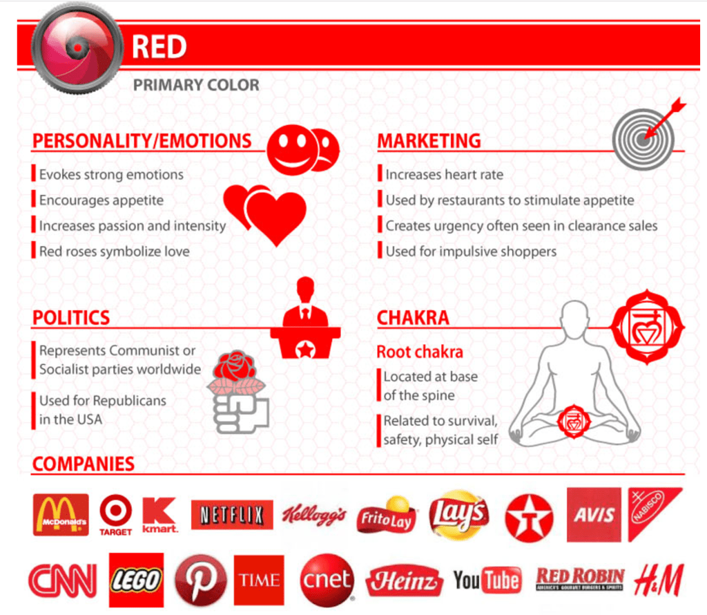
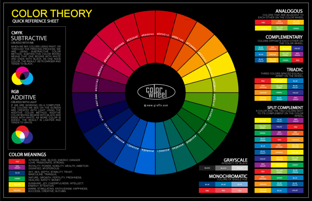
Red, for example, indicates that something presents urgency and you need to sit up and pay attention. Yellow indicates something sunny or cheerful. This conveys that a company has a product that brings happiness, cheer and joy. Green, the color of money, is used to denote health, both environmental and physical. Orange signifies both warmth and caution. It warns to beware of something, but can also convey something that is helpful. Check out this full page infographic for more information about each color and its significance.
How do I apply this to my marketing?
Well, that entirely depends on your goal. If you are trying to appeal to a certain demographic, you need to select your color palate carefully. For example, a security company might choose a red color to convey a sense of urgency, but also choose blue to convey stability. There is a number of color combinations that will get across your messaging, but being careful about your selections is key.
The reason that this is most important is that the message that you’re sending can be misconstrued if you pick the wrong color combination. The University of Toronto published a study about color combinations when appealing to your general consumer demographic. They indicated that most people prefer a simple color palate of 2-3 colors, rather than a larger range of hues. Research also presents an indication that people prefer certain colors over others, but this changes when the colors are combined with other colors. In other words, it is difficult to determine which colors to use in many cases. However, if you know what you want to convey, selecting your color combinations based on those traits can be very helpful.
When selecting your color combinations, make sure that they are something that will appeal to the eye. You not only need colors that have a message, but you also need colors that will catch someone’s eye when glancing at the marketing material that you have put out. Since you are spending your time and money on this material, it is vital that it be effective. When you look at case studies of existing successful brands, you will find that the logos have eye catching colors that are normally bright, vibrant and complimentary color combinations.
For example, the Microsoft Windows logo uses blocked, vibrant colors that are eye catching and provide a sense of confidence in the product. Consisting of four blocks of color, it conveys prosperity, strength, warmth, and peace. All of these emotions are consistently in line with what people want for the experience in using a product.

Wrapping it all up
What we have learned in this process is that the psychology of color is not an exact science. There is no magical combination that will provide you with unceasing supplies of customers. You, however, do have options when it comes to color. In the end, it is important and vital to select color combinations that will compliment each other and will draw attention.

